


Overview
A consistent visual identity ensures Coquitlam remains a desirable place to live, learn, work, and play. Use this guide to apply the logo correctly, and familiarize yourself with the design elements as new uses emerge.
The Importance of a Visual Brand Identity
A strong and consistent visual identity acts as an ambassador for the City. Consistent use of this guide will ensure that the City of Coquitlam maintains its reputation as a place where people choose to live, learn, work and play.
The standards and guidelines outlined in this manual will help you use the City’s logo, brand and visual identity appropriately. This ensures that everything produced visually represents the City’s brand in a clear and consistent way.
For more information about how to apply the City of Coquitlam visual identity, please contact:
Julia Clissold, Visual Communications Supervisor,
604-218-0796
Reconciliation
Lens of Reconciliation
The City of Coquitlam prioritizes reconciliation, recognizing and respecting the Indigenous communities on whose traditional territories Coquitlam stands. Our work reflects a commitment to honour Indigenous cultures and histories, employing language and visuals that foster respect and understanding. Through genuine partnerships with local Indigenous communities, we integrate their perspectives into our communications, aspiring to be an organization that supports healing and mutual respect. This approach underscores our dedication to inclusivity and reconciliation, ensuring our work resonates with the principles of acknowledgment and shared stewardship.
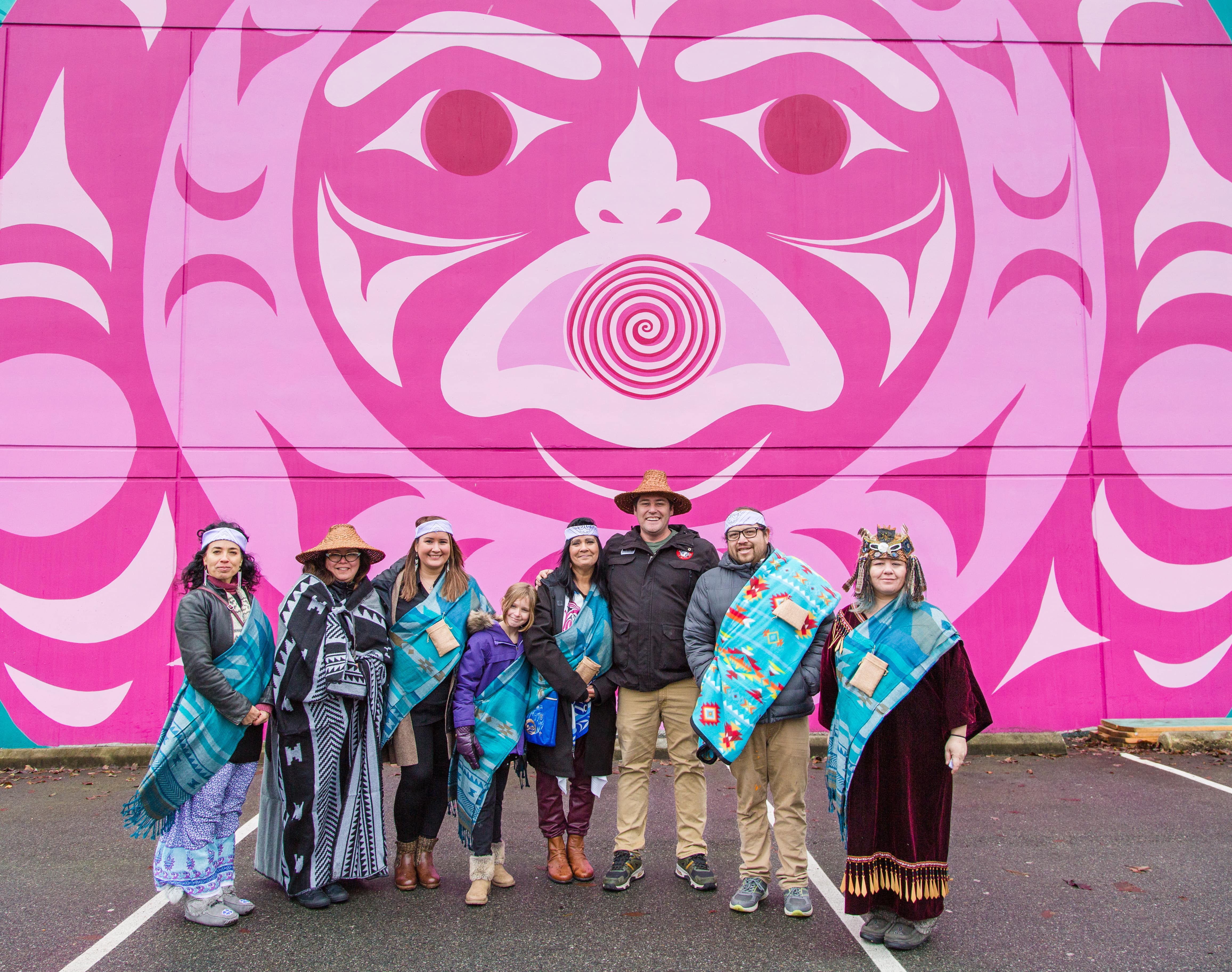
Land Acknowledgment
We acknowledge with gratitude and respect that the name Coquitlam was derived from the hən̓q̓əmin̓əm̓ (HUN-kuh-MEE-num) word kʷikʷəƛ̓əm (kwee-KWET-lum) meaning “Red Fish Up the River”. The City is honoured to be located on the kʷikʷəƛ̓əm traditional and ancestral lands, including those parts that were historically shared with the q̓ic̓əy̓ (kat-zee), and other Coast Salish Peoples.

Equity, Diversity & Inclusion (EDI)
As an organization, Coquitlam is on a journey to better serve our vibrant and diverse community by incorporating an Equity, Diversity and Inclusion (EDI) lens in all City business.
With respect to the City’s visual identity, this includes for example:
• Choosing photography that reflects the diversity and lived experiences of the community (this can include, but is not limited to, age, gender expression, ethnicity, body type, ability, family make-up, etc.)
• Graphic design that applies best practices in accessibility and inclusion (see Introduction to accessibility)
• Using inclusive language throughout City materials (see Style Guide)
• Using accessible language that is easy to understand (see Style Guide)
Related downloads
Relevant downloads for this section of this brand guideline.
