


City Logo
The City of Coquitlam logo is a wordmark that includes a stylized Q.
Design Elements

Spacing
To maintain the integrity of the brand, space must be left on each side as well as above and below the logo. The increment used to determine this space is based on the height of the lower case letter “m” (x-height). A minimum of two units of space are required on each side, two units above and two units below as shown in the example on the right.
Size
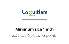
The logo should be used no smaller than one inch in width. Logo files can be found in the Visual Identity Portal. Space on sides equal to one unit of the height of the lower case letter “m” commonly referred to as (x-height).
Stylized Q
The stylized Q from the Coquitlam logo can be used sparingly as a design element, but is never used in place of the logo.
Logo Do’s and Don’ts
Proportions
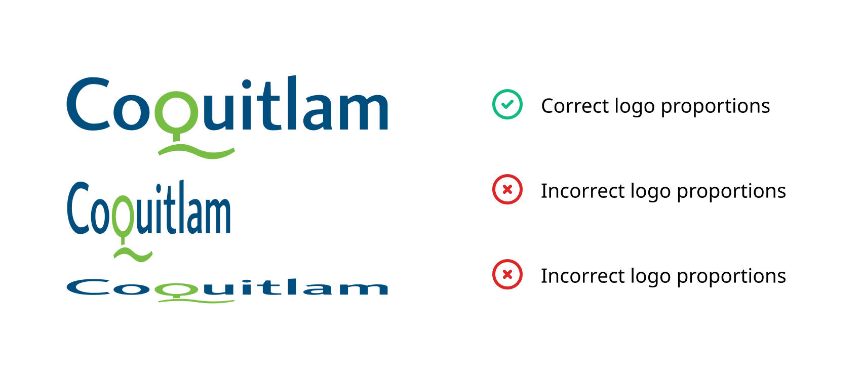
When using the logo for any purpose, do not stretch or alter the proportions. Always maintain the correct proportions. These are defined by X and Y coordinates which refer to the horizontal and vertical measurements and are expressed as a percent.
Horizontal – X = 100%
Vertical – Y = 100%
Standalone Q
Never to be used in place of the logo.
Proportions
Do not stretch or alter the proportions.

Modification
Do not personalize or attempt to imitate the logo. This includes colour, type choice and size.
High Resolution
Logo should be used at a high resolution of 300 ppi and at 100% of desired final size.
Logo Formats and Use
EPS format (vector-based) is scalable with no image degradation and is the preferred version for use. The PNG format is preferred for use in electronic and web applications.
The two-colour logo is the primary mark and should be used wherever possible. Black or reverse (white) logos should be used in situations where the two-colour logo cannot be applied, or for scenarios where a higher contrast with the background is required. The one colour (301 blue – not shown) is only for use in single-colour offset printing.
Joint Logo Considerations
When using supplemental logos or marks, be sure to follow the spatial considerations as outlined here. The logos should appear aligned.
• Do not change corporate colours.
• Never use the primary two-colour logo when placing the mark over a photo or colour box.
• Keep contrast and legibility high. Maintain 60% or higher tonal contrast whenever possible.
Black logo: on 40% grey,
White logo: on 60% grey.
• Never place logo in a white box over a colour box or photo. When placing the logo over solid colours use the black or white versions only.
• Maintain consistent spacing between logos to ensure visual harmony and brand integrity across all applications.

Black & White Logo
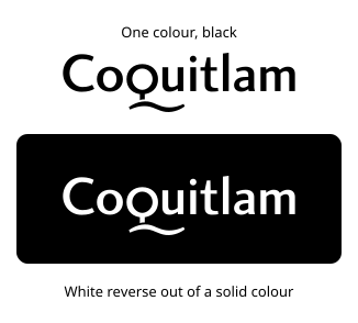
Black and white versions of the logo are available for use when two-colour printing is not available.
In special cases where the logo needs to be placed in a solid field of colour, and will not read properly if used in black, it is acceptable to use a reversed version of the logo so that it appears as white. Care should be taken to ensure that there is adequate contrast between the logo and the background colour.

Brand Support Typeface
City Fonts
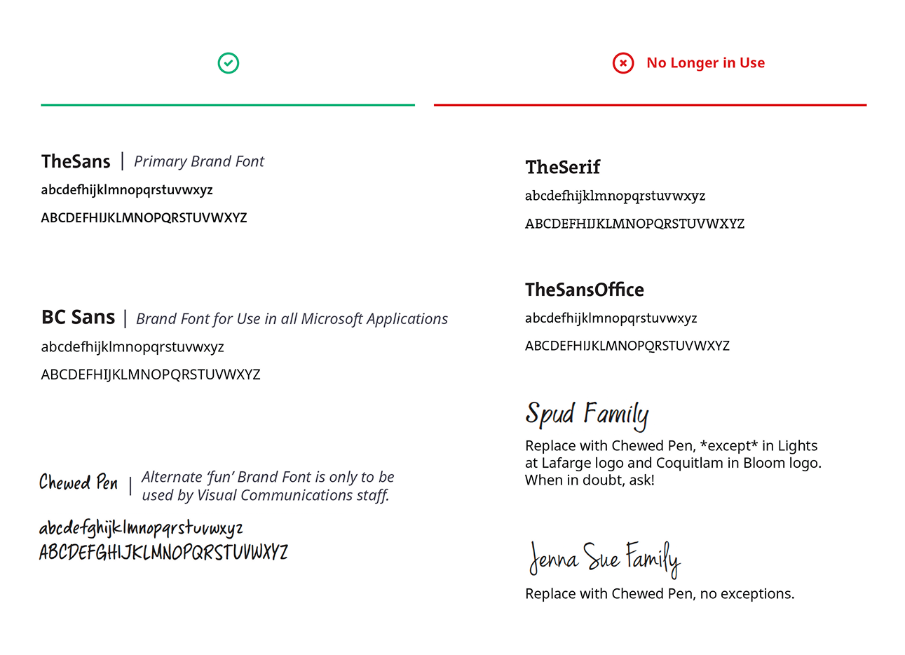
The primary font family used by the City of Coquitlam is TheSans. Communications and Civic Engagement uses the enhanced family set with eight weights from extra light to black (condensed and monotype versions included for use in numerical data, charts and figures).
All other City departments use BC Sans, which consists of three weights (regular, italic and bold).
BC Sans is an open-source “living” typeface developed for government to improve the readability and delivery of digital services. It was designed to support special characters and syllabics found in Indigenous languages in B.C. This font is geared to the office environment and is considered an accessible typeface. The weights are adjusted for laser printers and are optimized for display on computer monitors.
TheSans vs BC Sans
“TheSans” is the City’s primary font, designated for designed public-facing materials. Licensing is exclusive to the Communications and Civic Engagement division. For documents created in Microsoft applications, “BC Sans” is the alternative, accessible to all city devices. For projects requiring “TheSans,” please submit a communications request for design support.
Related downloads
Relevant downloads for this section of this brand guideline.
