


Iconography
Reinforcing Content Graphically
Usage
Icons improve accessibility of information for individuals who do not speak the language, or have trouble understanding the information presented. The City uses glyph icons: flat, filled, monochromatic objects with negative space and rounded corners; never incorporating texturing, shading, or highlighting. Icon designs are minimalistic and simple, conveying single ideas.
If you require certain City of Coquitlam icons, please contact:
Julia Clissold
Visual Communications Supervisor
[email protected]
3000 Guilford Way, Coquitlam, B.C., Canada, V3B 7N2
604-218-0796
When using icons, consider the following:
- Does the icon clearly communicate a concept or message in a single glance without the need for text?
- Does the icon relate to the concept/message it is being used to reinforce?
- If the icon depicts people, are they inclusive?
When creating or requesting new icons, consider the following:
- Is the icon scalable?
- Does the icon clearly communicate a concept or message in the absence of text?
- Is there an existing icon for this message/concept or a similar icon that could be further expanded to keep consistency?
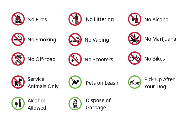
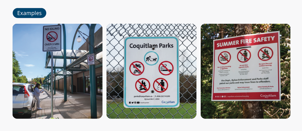
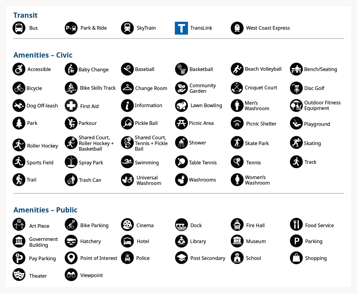
Wayfinding Icons
Iconography
The City uses icons to reinforce key messages and information. Icons improve accessibility of information for individuals who do not speak the language, or have trouble comprehending information.
We design icons to be universal across various projects and mediums for consistent use wherever possible. If an international standard for an icon exists, preference is to use it. If you require icon development, please contact the Visual Communications Supervisor.
Related downloads
Relevant downloads for this section of this brand guideline.
