


Colour Usage
A blue representing water and a green symbolizing the connection to nature were chosen as the corporate colours for the City of Coquitlam.
Main Colours
Corporate Colours
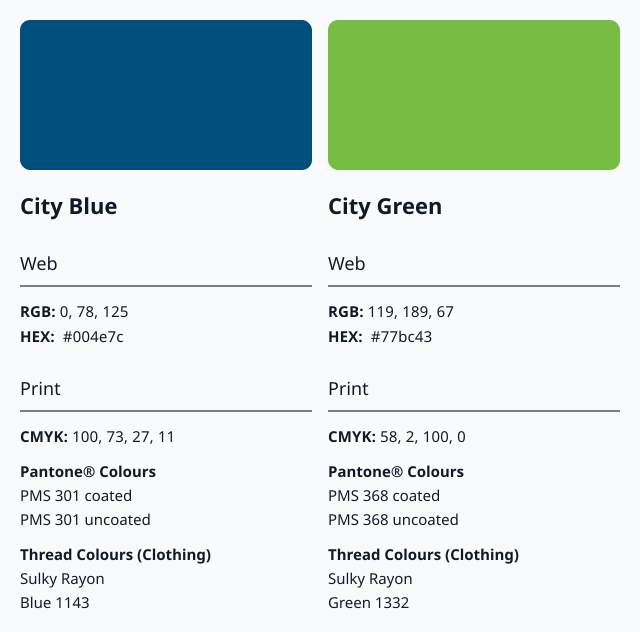
Designated Pantone® colours and their equivalents for other methods of reproduction are indicated below. We follow these colour standards present a consistent and unified visual identity.

The City’s Colours
The foundation of the City’s visual identity is built on two distinct colours: City Blue and City Green. Also known as the City’s corporate colours, these two colours are to be used as the dominant colours for the visual elements of projects, documents, signage and facilities. Consistent use of these colours reinforces visual recognition for our organization.
Black and White Logos
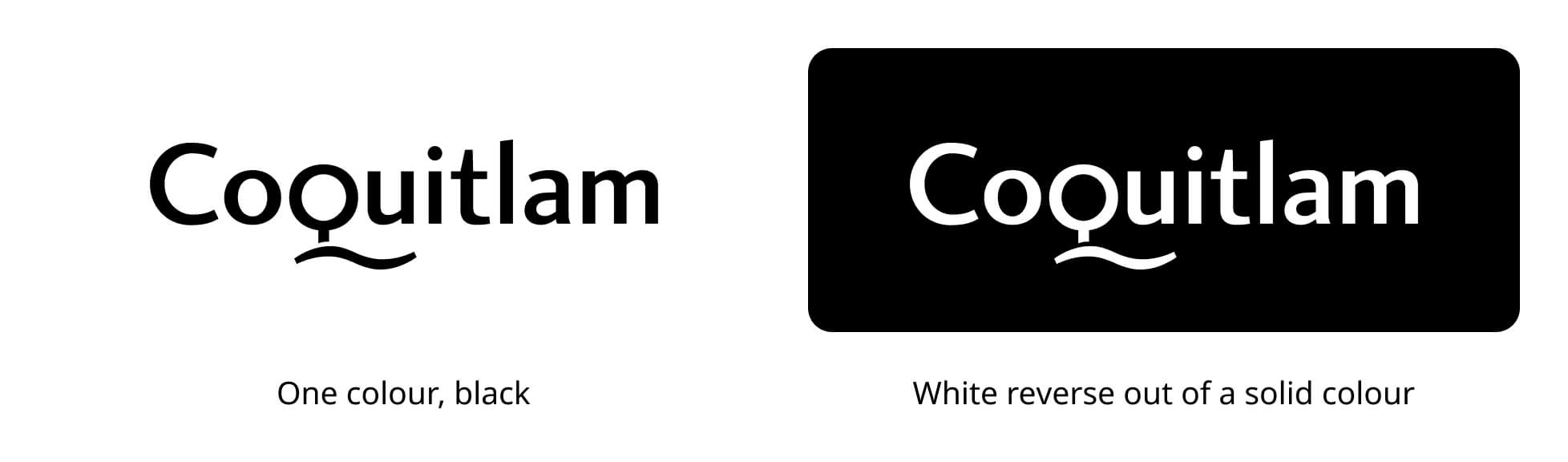
Black and white versions of the logo are available for use when two-colour printing is not available.
In special cases where the logo needs to be placed in a solid field of colour, and will not read properly if used in black, it is acceptable to use a reversed version of the logo so that it appears as white. Care should be taken to ensure that there is adequate contrast between the logo and the background colour.

Secondary Colours
Department Colours
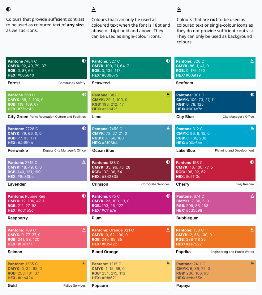
Certain secondary colours are used as official department colours for certain materials.
Secondary Colour Text & Contrast Requirements
Text Colour
Use white text on all colours except for Gold, Popcorn, Papaya and Lime, where Dark Grey font colour must be used.
White – #ffffff
Dark Grey – #41424f
Related downloads
Relevant downloads for this section of this brand guideline.
