


Content
Match our corporate style with these content guidelines.
Text Formatting
Text Treatment Standards
Content should be drafted at a middle school reading level using simple language. More detail on writing with simple language can be found in the City’s Writing Style Guide.
Document copy/text must be in the official City font (TheSans or BC Sans), plain weight, with a minimum font size 10pt. Paragraphs of text should always be left justified.
Use proper paragraph styles to ensure accessibility and legibility.
Bold and italic may be used sparingly for emphasis, but should not be used on large blocks of text or in place of paragraph styles.
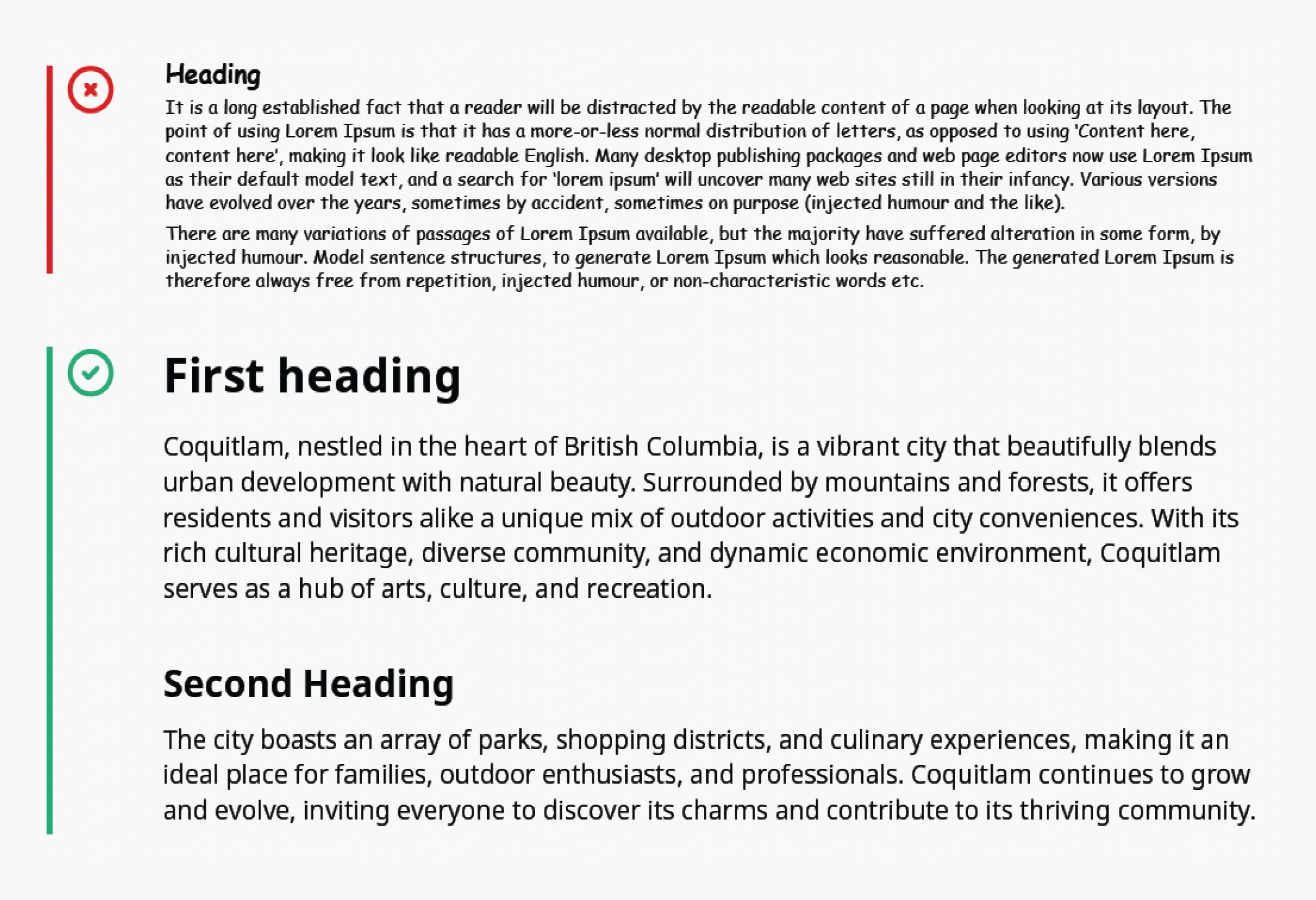
Document is here: City Document Formatting
QR Codes
What They Are
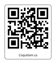
QR codes (Quick Response Codes) are two-dimensional barcodes that store information which can be read by smartphone cameras. They efficiently direct users to digital content, such as websites, contact information, or multimedia, with a simple scan.
When to Use Them
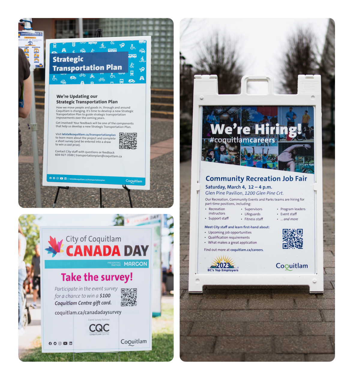
- Directing to Online Resources: Use QR codes in print materials (brochures, posters, signage) to bridge users to online content, such as detailed guides, event pages, or feedback forms.
- Instant Access to Services: Facilitate quick access to city services, apps, or registration pages.
- Interactive Campaigns: Enhance engagement in campaigns by linking to interactive content or experiences.
When to Avoid Them
- Inaccessible Locations: Avoid using them where internet connectivity is unreliable or where scanning them would be challenging or unsafe.
- Redundant Usage: If the content can be easily typed or accessed, the use of a QR code may not offer additional value.
- Avoid applying QR codes to design materials as stickers as this is a tactic that many scammers or fraudsters use. Law enforcement encourages the public to watch for this and avoid scanning when a sticker is found.
Formatting
- Colour: Ensure high contrast between the QR code and its background. Standard black on white is safest, but colours aligned with Coquitlam’s brand palette are acceptable if legibility is maintained.
- Minimum Size: A minimum of 1 x 1 inch to ensure scannability across devices.
- Placement: Position QR codes where they are easily seen and can be comfortably scanned, preferably at eye level or on flat surfaces.
- Shape: Typically square, but slight creative alterations are allowed as long as they can still be scanned.
- Clearance Zone: Maintain a clear margin or “quiet zone” around the QR code, at least equal to the size of one of the squares in the QR code to ensure scannability.
Related downloads
Relevant downloads for this section of this brand guideline.
